How to choose the right paint for your room
Colour is the secret weapon that will take your home makeover to the next level. But it’s not always easy to choose the best hues. There’s more to choosing the right paint than focusing solely on the colours you like.
Let’s take a closer look at interior painting and decorating and choosing the right colour for every room.
Consider the direction your room faces
The direction your room faces is one of the most important factors to consider when looking at how to choose paint. This is because the quality of the light entering the room differs from direction to direction, and this changes the appearance of the colour when it’s on the walls. This is also something to remember if you decide to wallpaper one or more of the walls.
North-facing rooms receive cooler light, so it’s best to avoid cool colours that tend to look flat and even cooler in this light. If you want a neutral colour scheme, opt for colours with yellow or pink undertones for some warmth. If you want to introduce bursts of colour, go for pinks or yellows. East-facing rooms receive bright light early in the day and become cooler as the day goes by. Choose either a strong colour that will liven up with the morning sun, or a green, blue, or pale neutral with a green or blue base to balance the brilliant morning sun.
South-facing rooms receive warm light that flatters colours throughout the day, although most colours will look more yellow in this light than they do on a paint chart. Cooler colours will create a breezier atmosphere. If you’re looking at neutrals, choose those with a cooler base than you’d normally prefer, as the light will warm them. West-facing rooms are cool earlier in the day and receive warm light in the afternoon, so you can apply the same principles used for choosing the right paint for east-facing rooms – intensify them with strong colours or balance them with cool colours.
How to choose paint for different rooms
When choosing the right paint for your home’s interiors, it’s important that your choices complement the rooms’ functions. It’s also important to think about having a common link throughout all of the rooms in your home to bind the whole design together. Having a singular colour that is used in every room, whether that’s in the skirtings or doors and windows, helps with the flow of your home.
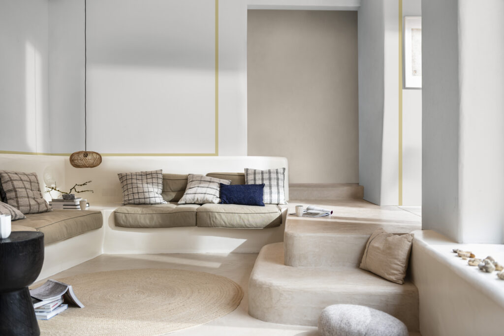
Living rooms
Choose white, off-white, or cream if you want the walls to provide a backdrop for strongly coloured furniture, accessories, and rugs. Grey neutrals are great if you want to introduce vibrant colour accents or layer with other grey tones. Peaceful blues are good if you’re looking for something trendy, while black is perfect for adding a sense of drama.
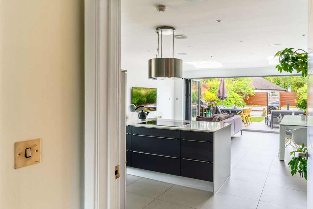
Kitchens
White or deep blue are a good choice if you’ve got white kitchen units. White and off-white walls also create a lovely backdrop for colourful kitchen cabinets. Alternatively, consider a warm paint colour, such as orange or yellow, to highlight the room as a sociable space, even if you only use the colour for a feature wall. If you want a fresher feel, pick mid-toned blues or greens.
Bedrooms
Choose pale neutrals if you want a calm feel in your bedroom or tap into the botanicals trend with foliage green walls. If you want to make the room feel snug, deep grey or indigo blue is great, especially if you have pale flooring. Wondering how to choose paint for a child’s bedroom? Colours such as blue or yellow, or stripes are all easy to update as the child gets older.
Bathrooms
White’s a good choice if you want to keep the look clean and spacious. Alternatively, focus on the element of water with ocean-inspired blues or greens. If your bathroom has a traditional style, a soft neutral such as pale grey or cream is ideal. A family bathroom can handle the boldness of fizzy orange, sunshine yellow, or acid green.
Create a colour scheme
Last but not least, let’s take a quick look at how to choose paints for a colour scheme.
Start by choosing three colours from an object in your home that you have an emotional connection with or that conveys a sense of comfort. This can be anything from a favourite piece of furniture, a cushion, or a painting you love.
Take that object to the paint shop and look for three sample strips with your chosen colours. This should give you a good select of colours to work with. Next, choose one of the three colours for your walls, choose one for furnishings or fabric and use the remaining colour for accents.
Dulux Colour of the Year 2023
If this approach isn’t inspiring your colour scheme choice, why not turn to the Dulux Colour of the Year 2023: Wild Wonder™? We spoke to Marianne Shillingford, Creative Director of Dulux, about the process behind selecting the Colour of the Year.
When we choose our Dulux Colour of the Year, we know that although this one colour must capture the mood of the moment, we need palettes of colours to create a complete decorating scheme around it.
So for the past 20 years, we have created 4 Colour of the Year supporting palettes that capture how we respond to the world around us and enhance what we really want and need from our living spaces. They are inspired by the conversations we have every year at our 3-day Colour Futures workshop which involves a panel of independent global experts in design, architecture, technology and social economics discussing the big topics that will influence the way we will be living in the year ahead.
For 2023, the big topic of conversation was nature and how we must work in harmony with nature rather than seeing it as a limitless resource. As we start to experience the negative effects of our impact on the planet, we discover what it really means to us and how we must respond to it.
The 4 colour stories that result from our conversations capture the biggest themes we have in common as a global community and bring them to life in colour for our homes. There are 10 colours in each palette – one of which is always the Colour of the Year, Wild Wonder.
The colour stories for 2023 are called Lush, Buzz Raw and Flow:
Lush
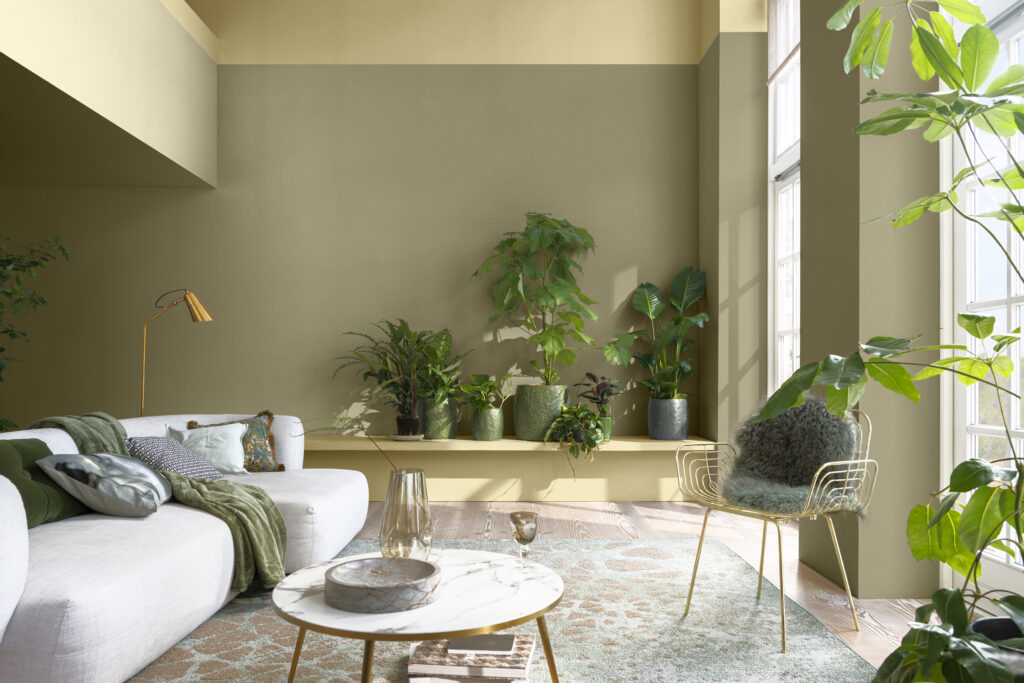
The Lush palette responds to the theme of nature as a healer in our homes and how over the past few years we have turned to nature as a place of sanctuary and solace to improve our physical and mental wellbeing. This is a palette of verdant greens and smokey violets which capture the subtle dynamism of living plants. Green provides us with the ultimate balance in colour and violet adds a dreamlike, sophisticated edge to the look. The combination of both in a room is quietly invigorating, just like a long walk in the countryside on a spring morning.
Buzz
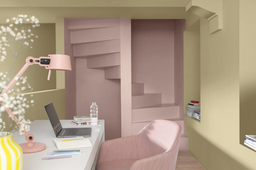
The Buzz palette captures the diversity of colour and life in a wildflower meadow. It reflects nature in a joyful way and each colour is designed to work together rather than be used individually. Just like our homes that are full of different mismatching things we have collected over the years, they are happiest when they are combined and work to pull separate elements into a unified whole. These are the decorative equivalent of filling our homes with flowers and working in spaces where we want to feel happy and uplifted.
Raw
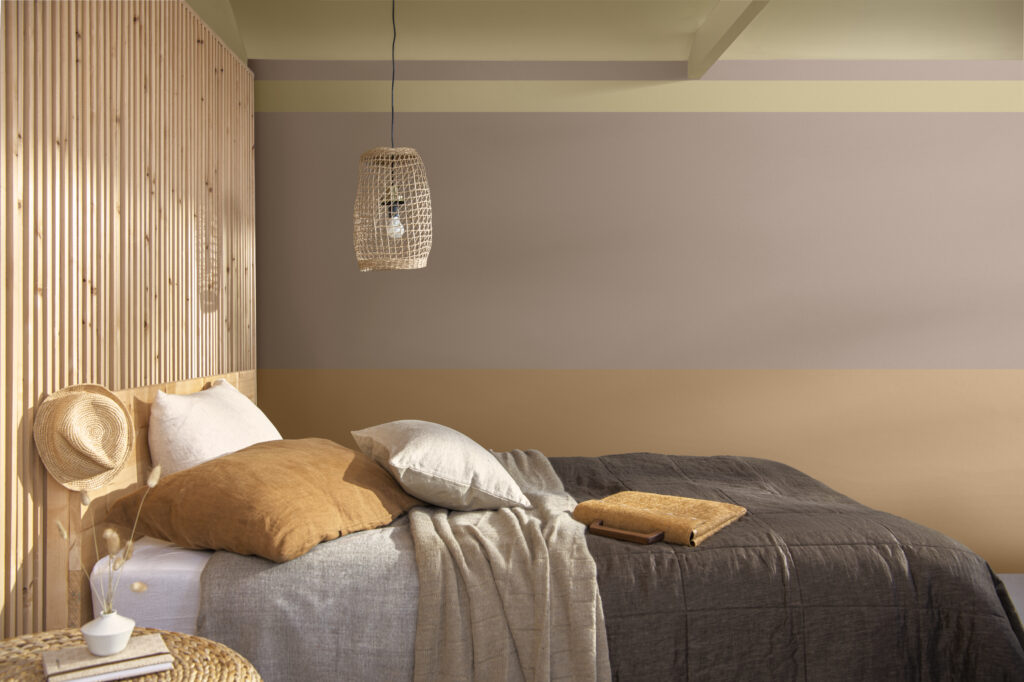
The Raw palette celebrates nature’s raw materials like earth, clay, stone and wood. These are familiar colours that we use with confidence on the biggest elements in our homes like flooring, furniture and accessories. This palette of warming rich natural shades adds nature in an elemental, soothing and timeless way. Even if you live in a modern apartment in the middle of a busy city, these colours reconnect us to the earth to make us feel warm, at ease and comforted.
Flow
The Flow palette captures the beauty of the biggest elements of nature – water and air in the sea and sky. It’s these expansive spaces in nature that help to make all of our troubles feel smaller and blow away the cobwebs of anxiety. Tranquil watery blues combine perfectly with reflected sky hues and Colour of the Year Wild Wonder adds the gentle glow of a warming sun to the collection. This is a palette of predominantly receding colours that help to make small spaces appear much bigger and together they provide the perfect antidote to feeling hemmed in when we are forced to stay indoors. Quiet, balanced and elegant, they bring a sense of equilibrium to a room, creating a space that feels at ease and comfortable in every season.
To find out more from Marianne and the team at Dulux about these our four inspiring new palettes and how they can change the feel of a room take a look at their guides and inspiration.
Need more help with choosing the right paint for your room? Let Paint My Home’s interior colour consultants support you with the process. Looking at redoing your home’s exterior? We also offer exterior painting and decorating services!